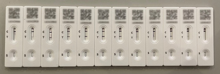
I recently had a rather nasty brush with the COVID-19 virus (public service announcement: the pandemic is not over, folks!). From the first day I experienced symptoms I started testing, but the tests only began to return a positive result on the second day. Surprisingly (or perhaps entirely unsurprisingly) despite feeling like my every thought had to struggle its way up from the depths of my brain through layers of cotton wool, as soon as I had a few days’ worth of tests accumulated I started to think about what the data showed, and what kinds of mathematical questions I could ask. Over the course of my COVID-19 experience, I kept track of the tests, and taken together they are a record of the pattern of the virus that can be explored.

It is always an interesting exercise to create (or curate) object graphs by using physical objects to form visual representations of data. Even very young learners can do this by sorting toys into categories and arranging them in a way that shows, for example, the relative sizes of groups; students can even arrange themselves into a ‘human graph’ based on some characteristic or preference too. My parade of lateral flow tests make a fascinating such example of an object graph; ordered chronologically they tell a story of the course of the virus. Perhaps this arrangement is enough? But statisticians are always looking for ways to abstract the data into different forms which can be worked with mathematically, and I am no exception. So how could I do this for my tests?
With a lateral flow test (LFT), a single (control) line indicates a negative test, and two lines indicate a positive test. It is worth noting that the accuracy of lateral flow tests is not anywhere near 100%. The Federal Drugs Administrator (a US regulatory agency) suggest that LFTs detect around 80% of infections, with the level of sensitivity to the virus lower at the start and end of the period of infection and hard to quantify in asymptomatic cases. This means that in the real world, a negative lateral flow test is not ‘proof’ that a person does not have the COVID-19 virus; on average, for every 10 tests that show no second line and look ‘negative’, around 2 people are actually likely to have the virus.
If I do make a simplifying – and possibly very wrong – assumption for these tests, that I was virus-free when the test showed a single line, and full of COVID-19 when two lines were on display, the data could be abstracted like this, with some colour added to make it easier to see the pattern:
| Day 1 |
Day 2 |
Day 3 |
Day 4 |
Day 5 |
Day 6 |
Day 7 |
Day 8 |
Day 9 |
Day 10 |
Day 11 |
Day 12 |
| − |
+ |
+ |
+ |
+ |
+ |
+ |
+ |
+ |
+ |
+ |
− |
|
− denotes a negative result
+ denotes a positive result
The use of colour seemingly makes it easy to infer my infection status, but only given the assumption that the test is 100% accurate. It’s important to question whether this conclusion is valid, when the real accuracy of LFTs is lower. I can ask some important questions at this point: Is it reasonable to infer that I was positive between Day 2 and Day 11? Is it reasonable to infer I was virus-free on Day 1 and even perhaps on the days prior to my first test? Is it reasonable to infer I was virus-free from Day 12 onwards? What extra information might I need about the accuracy of LFTs to decide? It seems clear that the safest way to deal with this data is to make a clear distinction between ‘testing negative’ and ‘not having the COVID-19 virus’, as it cannot meaningfully be said that the former implies the latter.
From this data I can see the time period in which I tested positive and count the number of days; I could perhaps use this count to compare to the average time a person tests positive for, but that’s about it. What if I transform this data into numerical data? One simple data move is to assign numbers to the qualitative descriptor; in this case assigning zero to a negative test, and one to a positive test makes sense.
| Day 1 |
Day 2 |
Day 3 |
Day 4 |
Day 5 |
Day 6 |
Day 7 |
Day 8 |
Day 9 |
Day 10 |
Day 11 |
Day 12 |
| 0 |
1 |
1 |
1 |
1 |
1 |
1 |
1 |
1 |
1 |
1 |
0 |
|
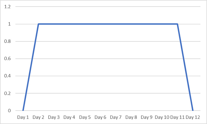
There are two advantages to this approach: firstly, I can put this in a spreadsheet and get the software to do the count for me. It’s not the most complicated count in this case but for larger data sets it can be a really useful technique. I can also use this data to quickly create new graphical representations using software, such as the one below.

With my new representation I can still tell the same story, but it also creates the impression of the course of the virus being more continuous, with a transition from testing negative to testing positive, and eventually back to negative again. While this better communicates that COVID-19 infection is not purely a binary quantity defined by the test result (although it is often discretised in this way for convenience in the real world), without careful communication it still risks creating the impression that I was virus-free at least early on in Day 1, and then again at some point from Day 12 onwards which may have real-world consequences in terms of infection control.
The sense of change created by the graph gives me an idea though: what if, rather than a binary choice of positive or negative, I assign a scale based on the weight of the second line, making a new (but almost certainly flawed) assumption that weight was proportional to my level of infection? Returning to the original object graph allows me to make the following table and a new graph:
| Day 1 |
Day 2 |
Day 3 |
Day 4 |
Day 5 |
Day 6 |
Day 7 |
Day 8 |
Day 9 |
Day 10 |
Day 11 |
Day 12 |
| 0 |
1 |
2 |
2 |
4 |
4 |
4 |
1 |
1 |
2 |
1 |
0 |
|
Of course, this is now considerably less objective as I have had to make interpretative decisions about the weight of the lines, along with an added layer of assumption about its meaning, but it does allow me to generate a more interesting graph and attempt to tell a more detailed story of the time I was ill:
On Day 1 I started to feel grotty. Over the course of the day I felt progressively worse and the next morning I tested positive for the first time. Over the next couple of days my symptoms worsened and I felt worst on the 6th day. After that I slowly began to feel better, but on Day 10 some of my symptoms came back briefly before I began to improve.
This description is remarkably close to my real experience within the data collected, but still does not resolve the issue of suggesting that I was either ‘ill’, or ‘well’ based on the lateral flow test result alone. Also, if I had continued testing for another week the (perhaps coincidental) relationship between the lateral flow test data and my symptoms may have likely diverged, the negative tests no longer giving any underlying information about the long tail of my illness. A subjective score based on how I felt rather than how I tested would probably look more like the graph below, which captures the graduation at the beginning and end of my period of infection far more accurately:
Used in conjunction with the lateral flow test data, this could be used to make very different - but perhaps better-informed - decisions about my infection status and the level of risk of passing on the COVID-19 virus to others.
Of course, lots of interesting questions remain when examining COVID-19 test results, for example:
- Is COVID-19 infection binary or not? Does a line communicating continuity on a graph send the right message? How might that message be distorted or misused?
- Does the weight of the line on a lateral flow test really indicate the “level” of infection? Might this also depend on the manufacturer of the test? The age of the test? Or how effectively the test was conducted?
Why not try generating graphs and data from objects with your students? How could they create quantitative measures from object data? Which representations and techniques could they invent to allow them to display or compare their data? Which problems, biases, or faulty assumptions might occur? And which interesting stories could they tell as a result?
Disclaimer: This blog is intended as a prompt for thinking about modelling with data, drawing inferences, and critiquing assumptions. It should not be considered medical advice, nor should the assumptions proposed be treated as valid.
Join the conversation: You can tweet us @CambridgeMaths or comment below.