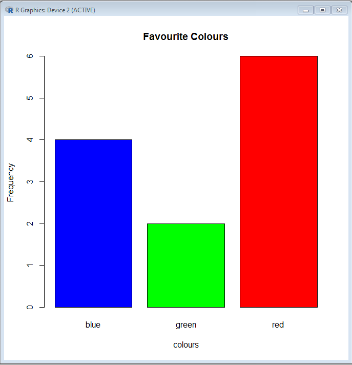
The first blog on using R in the classroom finished with something of a challenge: could you interpret what effect the various parameters in the code below had on your chart?

If you tried entering the code, a much more interesting chart is generated.

R works by using set functions with parameters (called arguments) added to customise the appearance. Our bar chart is very simple, but the flexibility of the R language means sophisticated representations of multivariate data are possible. Each function has a range of parameters that can be added, with any that are not directly referenced automatically set to a default by the software. You only need to worry about the things you want to change.
The parameters explained:
|
|
main = "Favourite Colours"
|
sets the title of the chart
|
xlab = "colours"
|
sets the label on the x axis
|
ylab = "Frequency"
|
sets the label on the y axis
|
col = c("blue","green","red")
|
sets the colours of the bars in the order listed. c() is an extra function that combines the values into a list, necessary to make this parameter work.
R has a set of pre-defined colours, but it is possible to put RGB hex codes between the quotation marks for finer control of the colour palette
|
To find out more about the various parameters that can be tweaked, R has an inbuilt help() function, which opens a web page for any function in the parenthesis; e.g. help(plot). At first glance these pages can be daunting, but as you become more familiar with using R you will begin to recognise standard structures and common arguments.
Frequency charts for discrete data
If you try to use discrete data with the functions we currently have available, the chart produced will look weird and will certainly not be a frequency chart. This is due to how plot() tries to process univariate, numerical data. A new function is needed.
First, record some numerical data in a spreadsheet column, save it as a csv file called “numbers” and import into R as we did previously.

The data is now recorded as a list, but it needs to be converted into a frequency table in order to work with plot(). To do this, use the command below.

I hope that by now you are beginning to be able to interpret the commands as you read them. “frequencyTable” is a new object in which the processed data will be stored, the assignment operator is sending the output from the table() function to this new object (frequency table), which takes the list and converts it into a table with a count of each unique value.
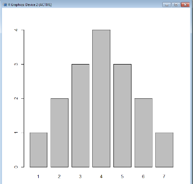
It’s now possible to generate a frequency chart by using the plot() function on the new “frequencyTable” object, but this will create a line graph. To get a bar chart, use the barplot() function instead.

As with plot() you can add parameters to customise the appearance of the bar plot. Have a go with your own data and tweet your creations to @Cambridgemaths