A recent episode of No Such Thing as a Fish, the QI podcast, bemoaned the misuse of Venn diagrams on the internet. Anna Ptaszynski was frustrated that people weren’t using them correctly. ‘You’ve just fallen into the biggest Venn diagram trap...ever,’ she says with a sigh when her co-presenter Alex Bell suggested the one below in response to her fact about John Venn (of Venn diagram fame) also designing a machine to bowl cricket balls.
So what’s the problem?
‘For it to work, the thing in the middle has to belong to both categories,’ says Anna. ‘It’s not just a thing plus a thing gives another thing.’
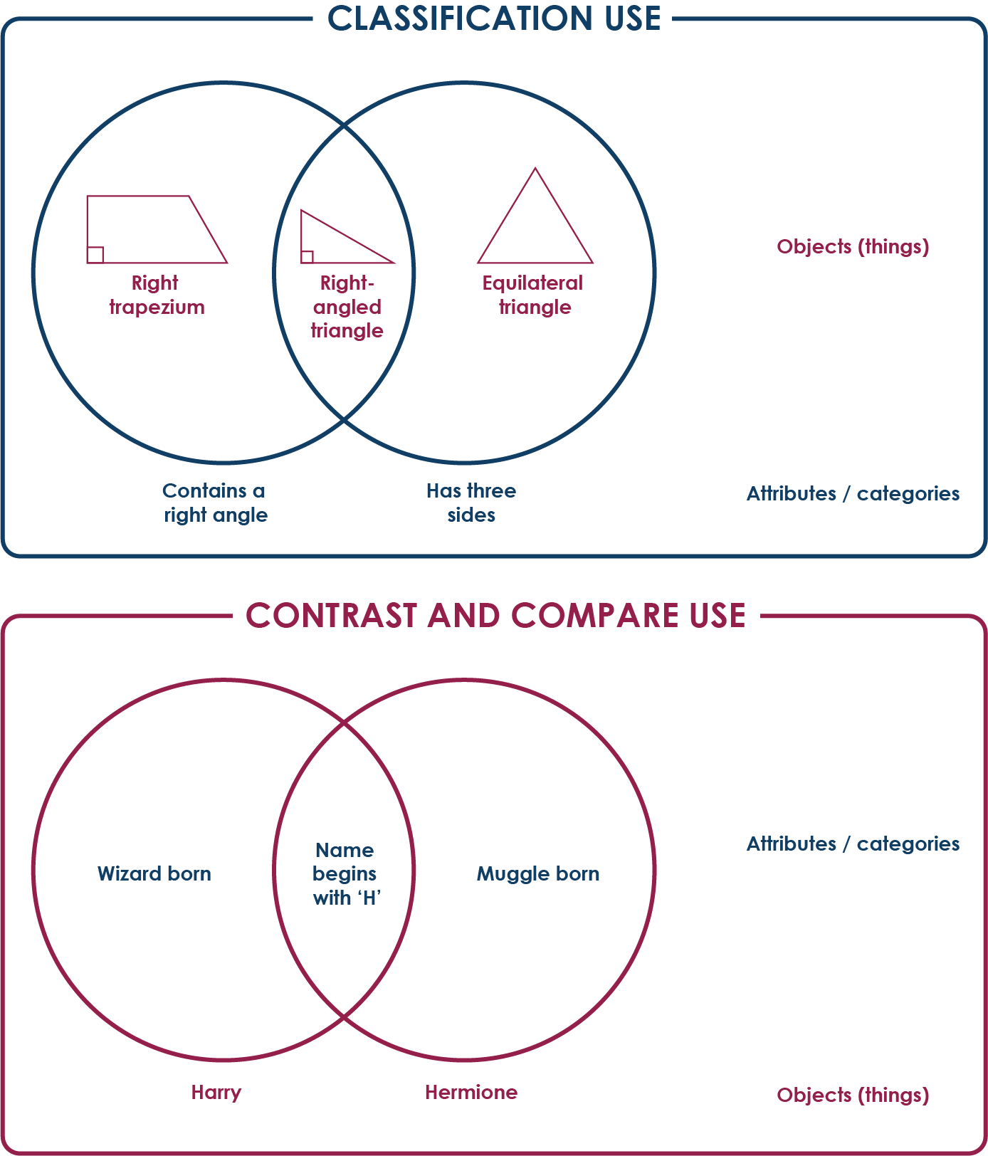
Kimmins and Winters (2015)1 identified this with great clarity: Venns are being used in two very different ways – often both alongside one another – with primary-age children, and often without any explicit attention drawn as to their different uses. When questioned, both teachers and pupils were unaware of these differences or complexities, or even that there were two types of common use. One type of Venn diagram – the classification use – is often used in maths lessons, and asks pupils to put things inside the circles and label the circles themselves as categories (or attributes/properties of that category). The second kind, often used in English or other humanities lessons, is the contrast and compare use, where the circles represent things, and the categories (or attributes/properties of that category) are put inside them. Below is a simple example of each. Do these look familiar?

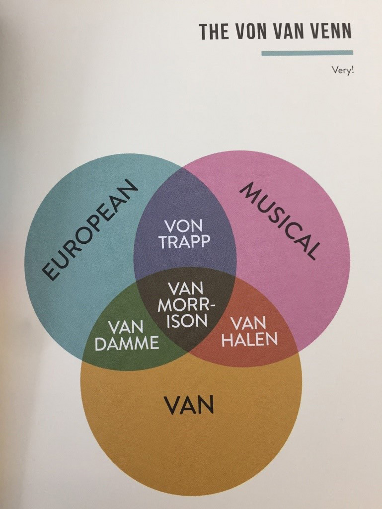
Alex’s poor Venn choice is nearer the contrast-and-compare type, but without any labels on the circles at all it is more like a two things and the (niche) thing that relates them graph – I’ll call it a niche overlap Venn for short. Often, like Alex’s, the distinction isn’t even really clear between the label in the circle (the set) and the/a data point inside it; these two may be mixed up together in the same Venn. There are plenty of these on the internet and some of them are very funny, like the one below from Chartography by Stephen Wildish2.

What we call Venn diagrams also now usually covers Euler diagrams, which is a similar concept but contains concentric sets – the idea of categories-within-categories. For example, if we drew a large circle to represent ‘equations’, then the circle representing ‘cubic equations’ would go entirely inside it, as there cannot exist a cubic equation that isn’t part of the larger category of equations. (I maintain that ‘marmalade’ goes inside ‘jam’ in the same way, but some readers may disagree.)
What’s interesting here is that the distinction we made earlier between objects and categories which seemed pretty clear-cut then, now might not seem so obvious. Is ‘cubic equation’ an object or a category? Is it as simple as whether it is plural or singular?
As with language, we would expect the field of data representation (to some extent) to shift, evolve and change meaning over time, and there is no reason why ‘Venn diagrams’ needs to go the way of Cornish pasties – reserved only for a very specific selection of objects to maintain particular boundaries. Equally, however, it could be argued that the blurred lines between categories and objects, sets and the data points within them has made the multiples uses of Venns confusing and contradictory. Do you share Anna’s frustration with the proliferation of ‘incorrect’ Venn diagrams?
I leave you with this final challenge – where would ‘this Venn’ go in this Venn?
References:
1Kimmins, D. L., & Winters, J. J. (2015). Caution: Venn Diagrams Ahead! Teaching Children Mathematics, 21(8), 484–493.
2Wildish, S. (2016) Chartography, Summersdale Publishers: China.
Join the conversation: You can tweet us @CambridgeMaths or comment below.